One Key Characteristic
“One of the first questions, I ask a potential new employees is, “Why do you like this type of work?” We already know everyone likes collaboration and autonomy, but I want them to dig deeper than that.” says Angela Staedt, PHR, SHRM-CP, Human Resources Director at TDA. Educational design is a rigorous process that involves dedication, technical ability and skill. Developing successful school facilities takes years of work, between district representatives, architects construction professionals and the community. A vast array of talents are used in these projects, but one key characteristic needed for any architect in educational design.
Angie continues, “You can have the most amazing talent in the world and be technically impressive, but if you don’t have curiosity that fuels dedication, then you may not be a good fit in this industry.”
This characteristic informs everything we do as creative professionals and allows us to drive forward despite challenges. We accomplish more than we think because of it. And it is the defining characteristic of our best educators and administrators, so there is no surprise it’s in our architects too.
“Those people who deeply think about this characteristic and explore how it impacts them, they will succeed here. Working collaboratively and autonomously is great,” Angie answers, “but those who are passionate towards education, architecture and communities–they will succeed.”
TDA and What We Do
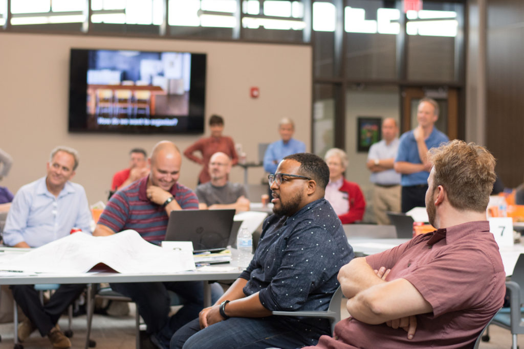
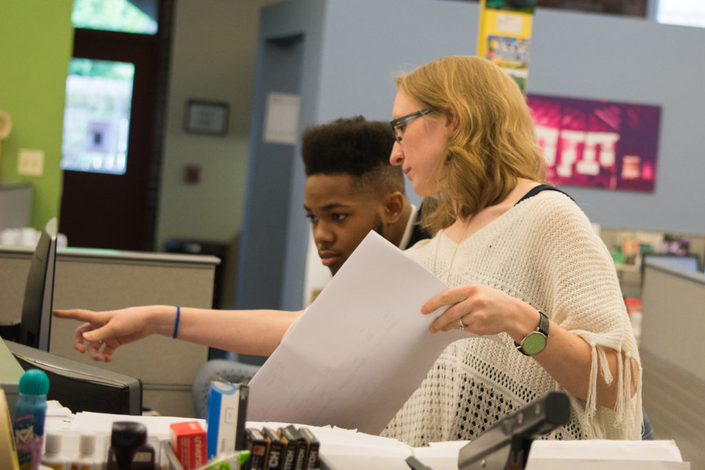
ThenDesign Architecture (TDA) is an architecture, planning and construction firm, located in downtown Willoughby, operating out of the renovated Junior High School building. During our over 60-year history, we have worked with over 120 passionate school districts in Northeast Ohio, partnering with them to develop unique, innovative, architectural designs that improve the education for the students and communities. Our work is characterized through facilities planning, new construction, building renovation and much more. Our staff is as unique as the districts we serve, and each one brings perspectives and experiences that complement the districts we work with. However, even though we are a diverse team, the one characteristic, passion, fuels all our educational designs.
Join our team!
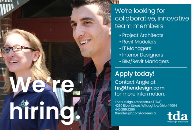
ThenDesign Architecture is looking for collaborative, innovative team members for a variety of roles including Architects, Revit Modelers, IT Managers, Interior Designers, BIM/Revit Managers. Apply today!
Contact Angie at hr@thendesign.com.
"Passion" - A Key Characteristic
The meaning of the word “passion” has morphed significantly over the years, with it more recently surging in popularity. It is characterized as an “intense enthusiasm for something.” However, even though it now takes a much more positive tone, originally it was derived from the Latin root word “to suffer.”
This somewhat paradoxical meaning makes sense when we understand that our “passion,” that enthusiastic drive, is what helps us make sacrifices to push forward a good cause.
Author Brad Stulberg, describes this condition in his book “The Passion Paradox,” Using the lens of high-performance athletes, he explains that our challenge is to balance a burning desire to achieve, with “overwhelming our sense of balance.” He believes that “Passion isn’t a one-time thing. It is an ongoing practice,” in other words, we are constantly balancing the extremes of drive and sacrifice. That paradox is present in passionate people. Their desire to advance their cause, bleeds into everything they do. “Your passion should not come from the outside. It should come from within.”
This one key characteristic, passion, is a key indicator of success in architecture, especially around educational design. Whether a project manager, or intern, passion is what allows us to succeed.
What Does our Staff Say?
“This isn’t just something I believe, it isn’t something that comes from an HR book, but everyone from the administrative team to our designers have shared this common thread.” From her unique position in HR, Angie recognizes this characteristic in every team member she works with. “It’s coming from our staff who regularly work together as a team. They drive towards the same goal and develop close relationships with one another as well as our clients.
“Passion” is one key characteristic needed by all architects in educational design.
Claire Bank, RA – Project Manager
- “I wanted to be in a field that benefited the community, designing buildings that benefited its users. Schools are ingrained in their community and have always served as hubs in some form. Now we are seeing more community aspects woven into them…A lot of people don’t realize how passionate I am about education. I taught Architecture at Kent State for a period of time and I’m also involved in the ACE Mentor Program. I am always trying to find other ways, besides designing schools, to weave education into my work. Maybe it’s genetic, my parents were educators, but I try to weave education into my career as much as possible.”
Ken Monsman, RA, NCARB, CCM, LEED AP BD+ C – Construction Administrator
- “There is nothing like seeing students using the spaces we designed at their school. Sitting in class during academic time, using the collaborative areas during lunch and after working in little groups on projects. The space is very flexible and useful for them. Architecture has a profound impact on people. Whether you are experiencing the building as visitor or you use it regularly. It’s very exciting to have a big influence on students by designing their schools. It’s very fulfilling and I’m grateful to have made the decision to join TDA. It has been a good experience for me, there are great people, good management and great projects.”
Cynthia Haight – Interior Designer
- “The design of schools is more important today than ever. We have to give our youth a place where they can truly learn and provide their teachers a place that is easy to teach in. That’s the only reason why I feel so passionate about this type of design, it’s fantastic.”
Adam Parris, RA – Project Manager
- “When we are given a design problem by a client and solve it, we are appreciated by them. However, you don’t see all the people that are benefited by that space afterwards. In my mind, the best praise you can give to a project is someone who walks in the building, enjoys their time there and walks out feeling like they’ve done what they came to do, and want to come back. Seeing people enjoying the space drives me to continue designing.”
Mackenzie Kicher – Architectural Intern
- “Being at TDA was the first time I was exposed to educational design. You most likely went through school but rarely thought about how it works, there’s just so much to it. Designing a science lab is completely different than designing a room for preschoolers or kindergartners. As a student, there is only so much that school can teach you, you just need to get into an office and see how it works. The experiences I have had, I didn’t even know I needed them to be a good architect. Now going back into school, I feel much more passionate about these spaces and confident since I learned them firsthand.”
Developing this one key Characteristic - Passion
“Staff stay at TDA because they enjoy the people they work with almost as much as what they do every day. One common factor people love it here, is that they realize they are doing something for a much bigger cause creating purpose.” Angie has heard the same comments from many designers at TDA, “It’s something bigger than what they could do alone, it makes a difference in a community for decades, so our work is meaningful.”
If you have a passion or curiosity for educational design, our team would love to connect with you. Passion is a characteristic that can be developed over time but often comes from within. We have found that even if someone isn’t familiar with educational design, once exposed to it, their own passion is ignited and they see the tangible difference they can make in education.
“So this is a continual process, as we develop new skills we can take inspiration from others who have tried things a little differently. Those who drive design forward, and who are passionate about what they do, there is limitless possibility.”
If you are passionate for architecture, and improving the education in communities, both now and for decades to come, we want to hear from you. We are looking for passionate individuals, so visit our Careers page and see how we can work together.
Reach out, and let’s develop a future centered around the passion for good educational design.


Let’s work together to make education better. Interested in speaking with us? Get in touch!

Ryan Caswell
Communications
Get our newsletter with insights, events and tips.
Recent Posts:
ThenDesign Architecture Celebrated its 35th Anniversary
Capital Improvement Plans Work
Rocky River’s Transformative Renovation
Cuyahoga Falls 6-12 Campus Construction Tour
Claire Bank Selected as 40 Under 40 Honoree

Ryan Caswell
Ryan is a communications specialist who is passionate about using digital media to further the goals of organizations and communities in Northeast Ohio. With a background in construction and a degree in architecture, he spent over a decade in corporate video production and brings this mindset to videography, editing, photography and content marketing. He is passionate about supporting the arts, and can be found hiking in the parks system.


